Orgamix
BRANDING & PACKAGING.
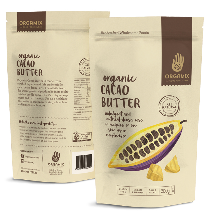
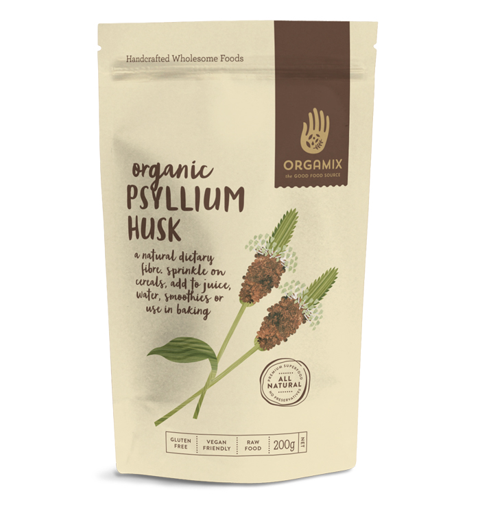
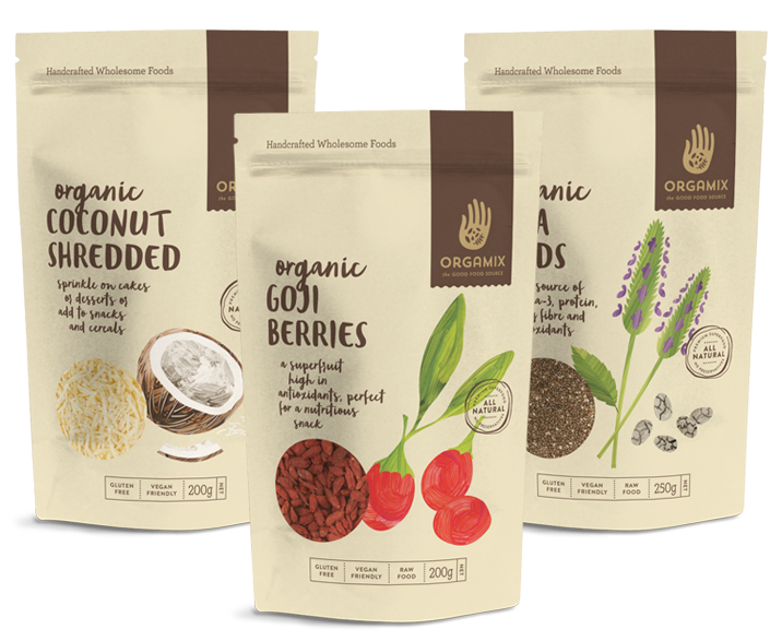
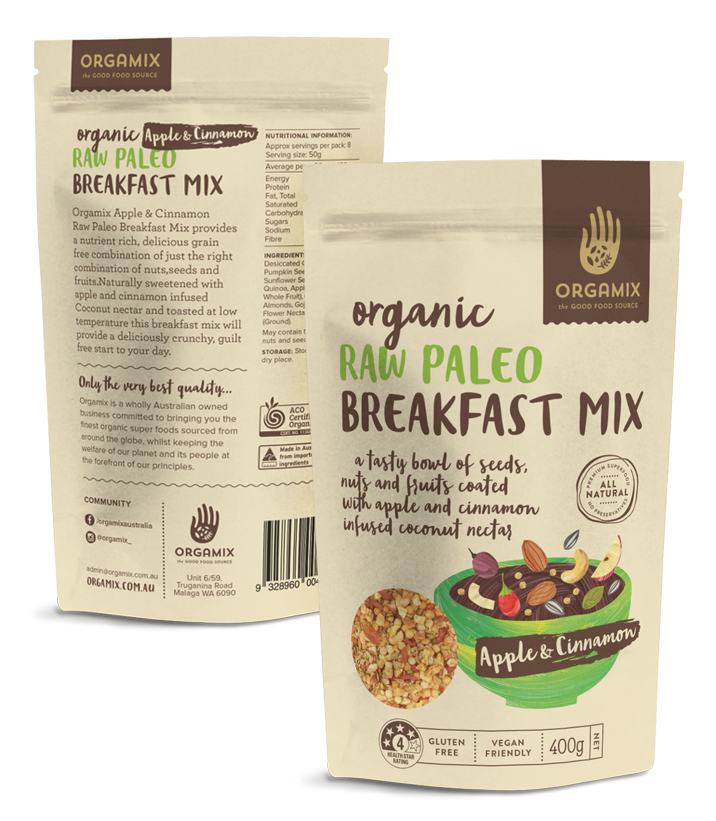
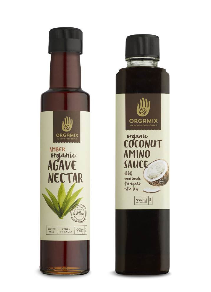
Orgamix sources superfoods from around the world to produce and provide well priced, pure and natural products. They required a rebrand that communicated that the brand and its products were raw and natural and overall didn’t look ‘too polished’.
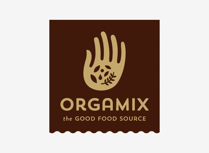
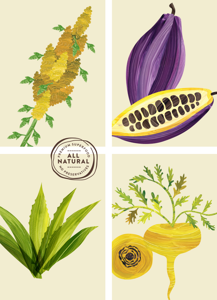
The logo is a simple hand graphic, with seeds, berries, herbs and a droplet to represent Orgamix's core ingredients and convey that the products are supplied in their natural form as much a possible after being picked.
Typography and illustrations convey a sense of rawness, with a graphic system designed to adapt across over numerous products such as bags, jars, bottles, canisters and cans for continuity and to build brand recognition.
Brand Identity
Brand Positioning
Tagline and Brand Story
Packaging
Illustration
Copy Writing
Art Direction
Print Management