The IMO
CORPORATE REBRAND.
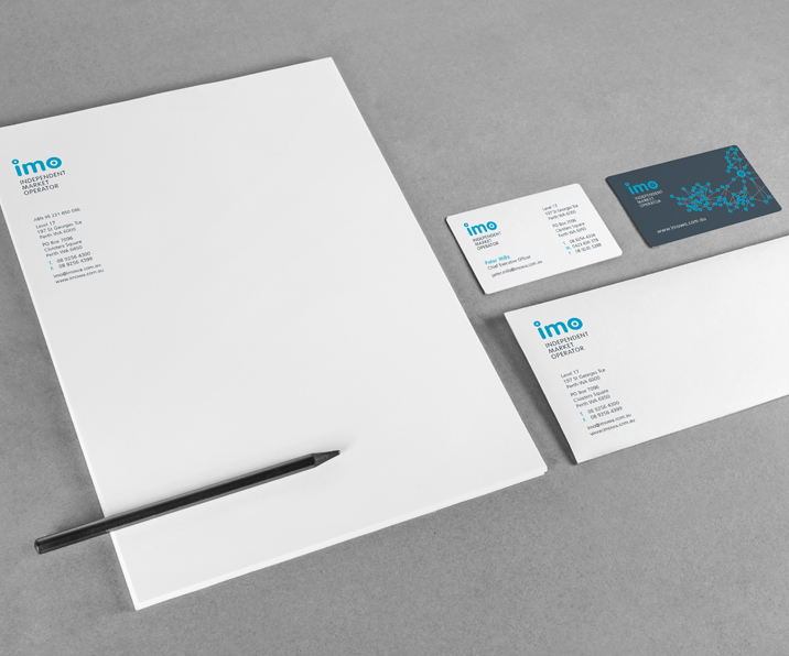
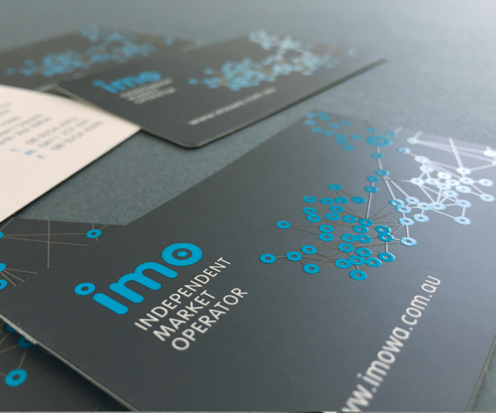
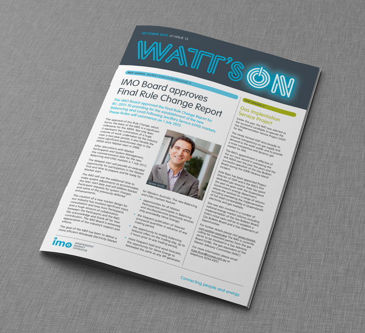
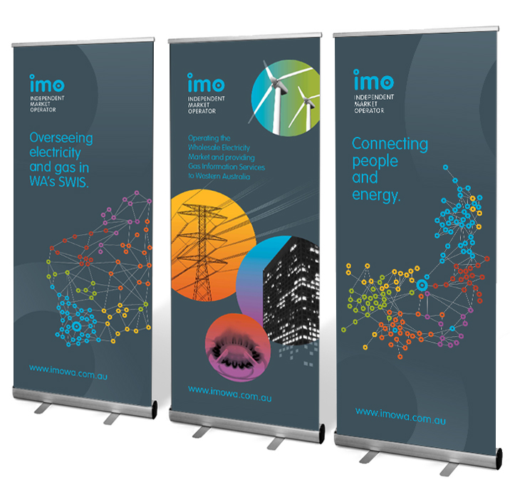
The Independent Market Operator (IMO) governed the wholesale electricity market in WA and required a rebrand and brand implementation across stationery, web, corporate brochures and electronic communication.
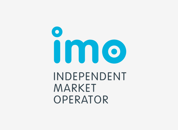
The branding reflects their core themes of collaboration, approachability, networking and innovation. The stylised logotype visually depicts the IMO as being an independent body that operates as a hub (as symbolised by the ‘o’) or effective centre, for market participants, industry and government, and emphasises the IMO’s role as a dynamic central resource for the energy market. The IMO has now merged with the AEMO.
Brand Identity
Brand Positioning
Brochures
Newsletters
Illustration
Print Management